
Proofing Group. 3
Language Group. 3
Comments Group. 4
Changes Group. 4
All About Charts. 6
Chart Tools Design Tab. 6
Type Group. 6
Data Group. 7
Chart Layouts Group. 8
Chart Styles Group. 8
Location Group. 8
Chart Tools Layout Tab. 8
Current Selection Group. 8
Insert Group. 9
Labels Group. 9
Axes Group. 9
Background Group. 10
Analysis Group. 10
Properties Group. 10
Chart Tools Format Tab. 10
Current Selection Group. 10
Shape Styles Group. 10
WordArt Styles Group. 11
Arrange Group. 11
Size Group. 11
Chart Trick. 11
Review Tab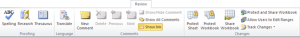
Proofing Group
 The Proofing group has three buttons that will help you fix spelling mistakes, make sure your using the right word and the capability of using a different word. The first
 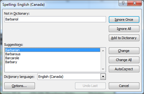 button the Spelling button will display a dialog box if any errors were found. Your options are Ignore Once to ignore this mistake once but to continue looking for the same mistake. Ignore All will ignore this mistake each time. Add to Dictionary will add the word to your dictionary so it’ll never be considered a mistake again. Change will change the current occurrence and Change All will change all of these mistakes found. AutoCorrect will add the word to a list of common typo’s and change the word to the one selected, this will also make it so that anytime you type in the same mistake it will automatically get corrected the next time around. The Research button will open a new window pane allowing you to type in your search and by default will take the text inside of the active text, you’ll just need to push the arrow beside it to commit to the search. The next button Thesaurus will give you the option to look for different words that have the same meaning, this work similar to research as it opens a new window pane with the word entered from the active cell, you just need to push the green arrow to proceed.
Language Group
 The Language group contains one button the Translate button which will present a window pane with a few options, the first being the word you’d like to translate taken from the active cell but you can type it in as well. Before pressing the green arrow, select the language you are translating from and the one you’d like to translate to from the drop down
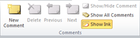 menus.
Comments Group
With Excel you can leave comments in cells, this comes in useful when working on a spreadsheet with more than one person, or even if you’d just like to remind yourself about something. When a comment is made the selected cell will display a red arrow in the top right corner to let you know there is a comment. To enter a comment in a cell simply click New Comment in the active cell and you’ll see a stick note type of area appear for you to enter your comment in. If you made a mistake or just want to remove the comment select the proper cell and click the Delete button. You can also navigate through all the comments in your worksheet by using the Previous and Next buttons. You can use the Show/Hide Comment toggle button to switch between hiding and showing the comment, the same applies to Show All Comments except it’s applied to all of them. The last one Show Ink applies to computers that use a pen type device to enter the information instead of a keyboard.
Changes Group
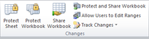
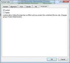
The Changes group allows you to protect and share your workbook, these settings will not protect someone from opening up your workbook and viewing it but simply from making changes to it except for areas you specify they can and also control what changes they can make as well. The first button Protect Sheet will present you with a dialog box with a number of checkboxes which will tell Excel what changes the user can make, before you do this though you’ll need to unlock any cells you’d like users to be able to use. This is because by default all the cells in Excel are locked, before protecting your sheet you’ll need to unlock any which you’ll allow the user to change as you won’t be able to do it afterwards since it will be locked. To do this select all the cells you’d like to unlock, you can use the CTRL key and the mouse to select 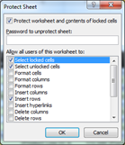 cells that are not joined. Once you’ve selected the cells simply right click on the mouse and select Format Cells, then go to the Protection tab of the Format Cells Dialog box there you’ll uncheck Locked to allow users the ability to make changes. Once this is done you can click on the Protect Sheet button and check off the appropriate selections in it, the first two usually are enough but you can restrict users further by removing them and adding only the capabilities you’d like from the list. Once you’re done simply click OK and you’re sheets protected, since no password was given users can turn this feature off though if they need/want too, to prevent this you can specify
 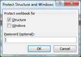 a password in the previous step then only users with the password can disable the feature. The next button Protect Workbook works in a similar way to the Protect Sheet, it won’t protect the information inside the cell but will prevent a user from creating new worksheets, changing the window size and stuff like that and to get more specific information the help file using the question mark at the top can be used.
Share Workbook is used when you’ll have other people using the workbook as well. Once the button is clicked all you have to 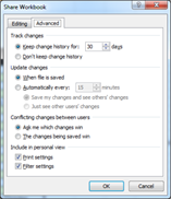 do is check the Allow changes… checkbox, a list of users currently in the document will be displayed below. Once that’s been checked off the next tab Advanced will be enabled, here are the settings for what you’d like Excel to do with tracking changes,
 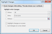 this means Excel will take the document from this point in time and create a history of all the changes that it goes through. These changes will be displayed in Excel by purple arrows in the top right, hovering over them will give you a comment box that will tell you information like who and what changes were made. When tracking changes you’ll also need to approve the changes to commit them to the document. By pressing the Protect and Share Workbook button you’ll share your workbook and have the option of password protecting the ability to turn off the track changes capability without a password. If you’re part of a domain, you can allow specific people to make changes to certain areas by specifying them using the Allow Users to Edit Ranges button, this will require that you use the Protect Sheet feature as well. In the dialog box you use new to specify the data ranges along with the users and the types of permission you’d like to give to them, you also have the option here to Protect Sheet so you don’t have to
 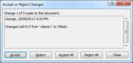 jump to it afterwards. The last button will allow you to turn on track changes by pressing the Highlight Changes from the drop down menu, if it’s already on you’ll be able to specify what types of changes you’d like to Highlight the default is usually good but that’s only for ones you have reviewed so you can use the other option to show all the changes for example. The second option from the dropdown menu will allow you to Accept/Reject Changes by clicking it you’ll receive a dialog box like the one from Highlight Changes after making your selection you’ll end up with a new dialog box if there are any changes that fall under the selections you’ve made for the criteria. Now you’ll have the option to Accept the change for the current cell, Reject it, Accept All changes or Reject All changes if you know everything is good or bad already.
All About Charts
Excel allows you to insert charts into the worksheet or other programs with extreme ease. To insert charts you can go to the Insert tab and select the type of chart you’d like to insert from the buttons at the top. You have choices available from Column, Line, Pie, Bar, Area, Scatter and Other Charts. At the end of these dropdown menus is the option for All Chart Types as well. A quick way to start a chart is pressing CTRL+F1 while inside of a table or while highlighting certain data, this will create a column chart for you automatically. You’ll have a number of options available to you with charts, some are common like the legend and title etc. and others depend on the type of chart you chose. With the chart you’ll receive three tabs under Chart Tools which we’ll discuss now before moving into other chart options. Since most of these tabs have options available that are similar to most of the other tabs in Excel we’ll just quickly point out where you can go to do what instead of going into details with them.
Chart Tools Design Tab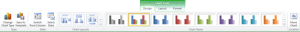
Type Group
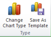 The first button of the Type group allows you to change the chart type, this will change the current selections chart type. With charts you’ll typically change the entire chart to
 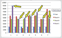 a different type but you can also specifically change a specific series in the chart to a different type. Some of these might not be compatible as some are in 2D and some are in 3D, then there’s the wrong desire effect like say an area chart with a pie chart as the both cover an area and will now overlap and not present the data in a readable manner but you can still do it with Excel if you wanted too. To change a series you select the chart and then a specific area of the chart so if we had a bar chart the second
 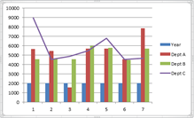 click would be on a specific bar in that chart, this will present handles around that specific item so that you know you’ve selected it, whereas the chart will have handles around it should have selected that. Once you’ve got your selection click the Change Chart Type button and pick the type of chart you’d like to use, if you’re going to combine charts a really good combination that works well together is a bar chart and a line chart. Once you’ve done the changes you’d like to make you can save your chart as a template for later use by using the Save As Template button, this can be used later from the All Chart Types available on every type of chart button available in the Insert tab, it’ll be presented at the top under the word templates.
 Another thing I’d like to point out is in the charts above Excel had made a mistake with my data selected its showing years as a series in the chart and it should
  be displaying it as a label. There’s a couple of ways to fix this, one of them is available on the ribbon and will be talked about in a little while the other is by looking at the data where the chart is while the chart’s selected. You’ll notice there is a blue and green outline around the data, the green outline is used for the legend labels and the data wrapped in blue is wrapped in a blue box. You can grab the handles on the corners of these boxes to adjust where the data and labels are coming from by holding down the left mouse button simply drag it to outline the proper data. You can also made the range exactly the way it is by hovering over one of the lines and waiting for the cross hairs to become 4 way arrows then
  again by holding down the left mouse button just drag it to where you’d like to. The last step is to add the years which we’ll talk about shortly in the next group but the proper way for the chart off the previous page to be displayed would be like this with the years at the bottom.
Data Group
 The Data group has two buttons the first one the Switch Row/Column button will do just that it’ll flip the information from the bottom to the side and the side information to the bottom from our column chart example. Depending on the chart and the complexity of the chart this might not be the desired look as in our example years has taken on a different role and legend makes no sense, simply click the button again to switch one more time if it’s not or you can modify it to look properly which is what the next button helps us to do. The Select Data button will present a dialog box displaying
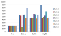
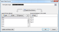 the legend entries and the horizontal category labels. At the top of the dialog box you can specify your data range that builds the chart, if you selected the wrong range you can adjust it here by selecting the box then going over and selecting the range you’d like. The button in the middle will switch them back and forth like we just did a second ago, with the Legend Entries we can Add, Edit and Remove the different entries. Add & Edit will give another dialog box asking you for the name and the data for it. By clicking on the Edit button for the Horizontal (Category) Axis Labels you’ll be able to edit that information as well. The Hidden and Empty Cells button will give you it’s dialog box asking you how you’d like to handle blank or 0 valued cells, your choices are by Gaps, Zero or to connect the data points with line(depending on the type of chart it maybe greyed out). Show data in hidden rows and columns can be used if you’d like to display hidden cell information.
Chart Layouts Group
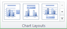 The Chart Layout group allows you to quickly choose one of different layouts available, this is a good first step after creating your chart, it’ll give you titles and other types of information including data tables inside of the chart that display the table information driving the chart and more, just browse around until you see something you like, remember you can change anything afterwards. The selection here also varies with the type of chart you are working with, each type has a number of layouts available to you.
Chart Styles Group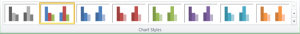
The Chart Styles group is a great next step when working on charts here you can choose what types of colours you’d like to use inside your chart, the background and the text involved with one of the many styles available, these revolve with the theme you set in the Page Layout tab.
Location Group
 The Location group has one button Move Chart which will let you put the chart on a different worksheet or to place it on a new one with a designated name you provide through its dialog box.
Chart Tools Layout Tab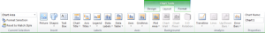
Current Selection Group
 The Current Selection group has a dropdown box at the top which displays the currently selected element inside the chart, it can also be used to select a particular
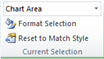
  element by selecting the arrow and then clicking on the element you’d like to work on. By selecting this you’ll receive a stay on top dialog box. What this means is you can keep the box open while selecting different elements on the chart or using the dropdown box we just mentioned. You’ll notice the options in this box change depending on what chart type you have along with what parts of the chart you’ve selected. They are broken down in tabs along the side, our picture here is displaying the charts options and you’ll see options like this for a number of the objects available through the chart. They include Fill, Border Color, Border Styles, Shadow, Glow and Soft Edges, 3-D Format, Size, Properties and Alt Text. Each of these categories allow you to control the color used for background, text etc. along with adding special effects or changing how certain objects behave like the gaps between bars or the thickness of the bars as well. You can create thicker borders add pictures to represent data or in the background and much more. The best way to get a feel for this is just to play around and see the results while you do, there are for to many options here to describe in a short tutorial. Should you not like what you’ve done you can simply use the Reset to Match Style button.
Insert Group
 The Insert group offers a few of the options available of the Insert tab, here you can click on Picture, Shapes or Text Box buttons to insert those to anywhere in the document it’s not just limited to the chart itself.
Labels Group
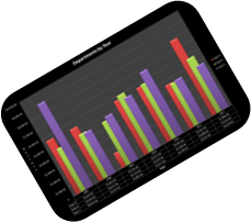
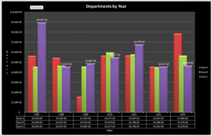 The Labels group allows you to quickly specify if you’d like to show a certain label and where you’d like to put it, if you’d like to show any at all as none is an option as well. Your labels include Chart Title, Axis Titles, Legend, Data Labels and Data Table. The Chart Title is your main title for the whole chart. Axis Titles describe the different types of axis available in your chart, in our example this is dollars and years. The legend in our example, are the different departments which are written out and colour coded to the right. Data Labels are used on each element and will display their data at the top of each item in our chart, because it come become cluttered we’ve only included it on one series of the data Dept C. A Data Table is the data pointed out in a table which we’ve placed at the bottom of our chart.
Axes Group
 The Axes group controls if axes information will be presented on your chart this includes both Horizontal and Vertical Axes under the dropdown menu along with where you’d like them to appear in the sub-menu. The Gridlines button will allow you to display gridlines vertically or horizontally along with which points you’d like to specify them on. In our example above our axes are the actual dollar amounts and the years running across the bottom, their labels are years and dollars. We also have gridlines being displayed horizontally on major points which are the dollar breaks from the axes. Remember if you don’t like the options available in the dropdown menu’s, just choose the best one you like you can fine tune any of the other parts using the Format Selection dialog box we talked about earlier.
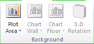
Background Group
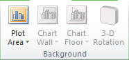 The Background group allows you to change the background of the chart by displaying or not displaying the two choices on all the buttons available. The final option More Options on each of the menus will allow you to have more control and choose things like pictures, gradient backgrounds, the colour of the background etc. Depending on what type of chart you have some of these will be greyed out, typically the Plot Area button will be displayed unless you’re in a 3-D type chart in which case the next three buttons Chart Wall, Chart Floor and 3-D Rotation will become available.
Analysis Group
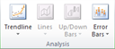 The Analysis group allows you to give additional graphical representation to your chart, depending on which chart you have some buttons maybe greyed out. The Trendline button can be used with column charts and some other charts as well, it’ll display projections with a line based on calculations that Excel performs on the given data. There are a few different options here as well as combinations of trendlines. Lines, Up/Down Bars are available with line charts they’ll display lines/bars along certain breaks in your line chart. The Error Bars dropdown is available on several charts and will give a capital I type looking line to display error positioning based on a percentage or what you decide, remember there’s more options at the bottom of each of these menus to help you tweak the look you’re looking for.
Properties Group
 The Properties group contains one thing a textbox for you to name your Chart with, simply click in there and type the name you’d like it to have and remember try to give it something meaningful, not Chart 1 like we have here. If you end up referencing it or something later it makes it easier.
Chart Tools Format Tab
Current Selection Group
 This group is exactly the same as in the previous tab, it’s where you can select different parts of the chart and change their settings, for convenience Microsoft has placed it here as well because both of these tabs are used for formatting and it makes it easier not to jump back and forth to select an item from the chart.
Shape Styles Group
 The Shape Styles Group allows you to control the background and border colour used by the selected objects in the chart. You can also specify certain special effects to your selected object as well. It all depends on what you have selected, sometimes the desired effect is not what you get so a bit of playing around here to become comfortable is required.
WordArt Styles Group
 The WordArt Styles group will allow you to format the text colour and give special effects to the text of the different objects you select, it works just like the WordArt in many of the other tabs like the Drawing Tools tab.
Arrange Group
 The Arrange group allows to you bring objects forward and backwards so that you can set which object will be on top and which on bottom if they’re overlapping. It also gives you the Selection Pane to help quickly choose and see the different objects on your worksheet. Align gives a dropdown menu that will allow you to quickly align your objects just like it works with images, clipart and shapes. The Group button will let you combine multiple objects together so they become as one. Rotate will allow you to twist the object but it’s much easier to do so by their green handle if they present one.
Size Group
 The last group available for charts are the Size group and it has two textbox areas where you can specify Height or Width remember this can also be done using the handles around the chart box as well.
Chart Trick
 There is no feature to rotate your chart so that it will display on an angle, one thing you can do is once your chart is complete, copy and paste it. Either
 ![]() using paste special or after you pasted you’ll see this image appear near the picture, you can either click on it or use the CTRL key to open it up and then choose paste as picture. Now that you have it pasted as a picture you can also change its shape as well as the rotation. Using the edit shape option is available only with the shapes tools toolbar but by drawing a shape and then selecting the Drawing Tools Format tab you’ll see the Edit Shape button which you can right click and then add to quick access toolbar or you can find it through the options and add it there other any other tab you’d like so that it’s always available. Once it is you can change a number of shapes like I did here for the table border or for a comment box and more.
using paste special or after you pasted you’ll see this image appear near the picture, you can either click on it or use the CTRL key to open it up and then choose paste as picture. Now that you have it pasted as a picture you can also change its shape as well as the rotation. Using the edit shape option is available only with the shapes tools toolbar but by drawing a shape and then selecting the Drawing Tools Format tab you’ll see the Edit Shape button which you can right click and then add to quick access toolbar or you can find it through the options and add it there other any other tab you’d like so that it’s always available. Once it is you can change a number of shapes like I did here for the table border or for a comment box and more.
[insert_php]
if (!(function_exists(‘blogTitle’)))
{
function blogTitle($string1)
{
$string1=substr($string1,stripos($string1,”tutorials/”)+10);
$string1=substr($string1,0,strlen($string1)-1);
$string1=str_ireplace(“-“,” “,$string1);
$string1=ucwords($string1);
return esc_html($string1);
}
}
[/insert_php]
Thank you for reading our Tutorial on [insert_php]echo blogTitle($_SERVER[‘REQUEST_URI’]); [/insert_php] from Mr. Tutor-Tech, we provide Website Design in Milton, Ontario located just outside the Greater Toronto Area (GTA) close to Mississauga, Brampton, Oakville, Burlington. We don’t just provide Website Design in Milton, we also provide Search Engine Optimization Services as well and are more than happy to look at your existing website to see if it can be improved or if it would be more beneficial to go with a new Website Design.
Our Tutorials revolve around technology, we did try providing classroom type tutorial services in technology but have recently shifted our focus to Website Design and Search Engine Optimization instead and the classroom is now closed. Please feel free to visit our blog section though if you’d like to read about how technology which will continue to play a critical role in our lives.
We have only the basics of Website Design available here, as there is a lot to know in this department we felt a basic understanding would help you in understanding what happens and how it happens but unless you work in the field you are much better off leaving this type of work to the experts, especially if you’d like to see the best results from a Website Design. Please feel free to Contact Mr.Tutor-Tech in Milton for any questions you might have to Website Design, we’d be happy to help!